A Mobile Responsive WordPress Website
Build on the Brand
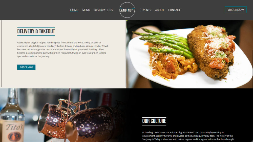
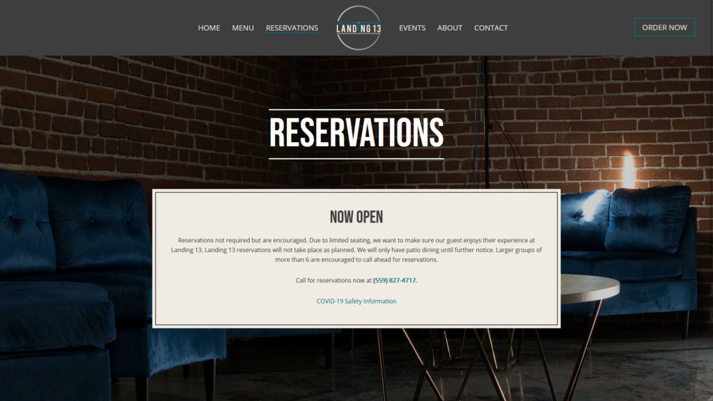
Landing 13 was a new venture. Besides some menu ideas, they had a logo, pictures of the venue undergoing renovation, and a few paint swatches. In other words, a mostly blank slate brand-wise.
Because Landing 13 was at an early stage when they started working with us, we knew that the web design would provide a foundation for the brand’s look and feel. We worked closely with their team to understand their brand vision (mood, voice, and presentation) and target customer.
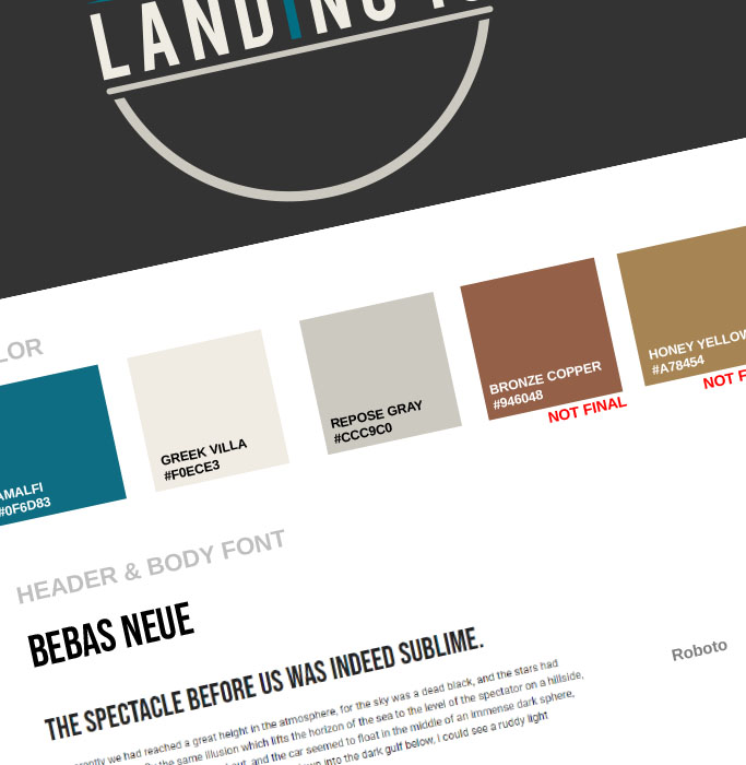
Our initial presentations to the client were about getting their feedback on potential color schemes, fonts, and design elements.
An Easy to Update Website
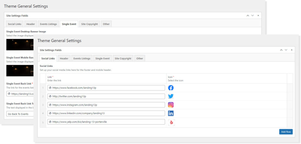
Landing 13 signed up for our web care plan for painless and turnkey website maintenance and support. But they wanted to be able to make simple site edits themselves without needing to be WordPress experts. We added theme settings to the admin dashboard to streamline the update workflow.
Make the Logo Pop
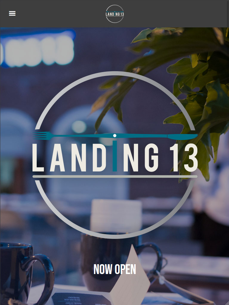
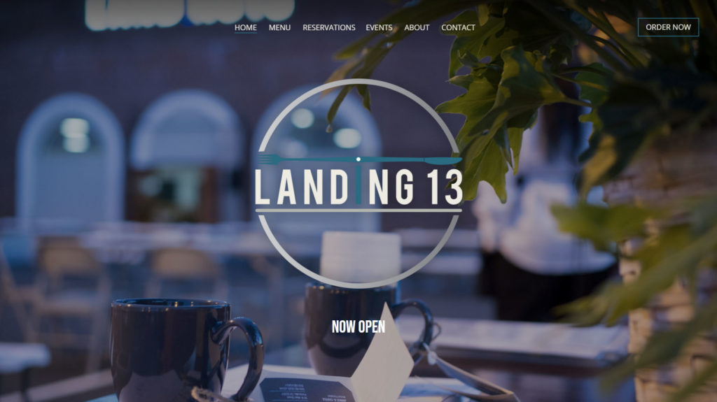
The Landing 13 logo, while attractive and thematically appropriate, presented a small design challenge. The round logo and its font looked small on the header menu, undercutting the new brand’s visibility.
We added an animation to the home page to address this concern. The home page prominently features a large version of the Landing 13 logo on page load. Then, when the user scrolls down, the logo tucks up into the sticky header.
An Easy to Update Website
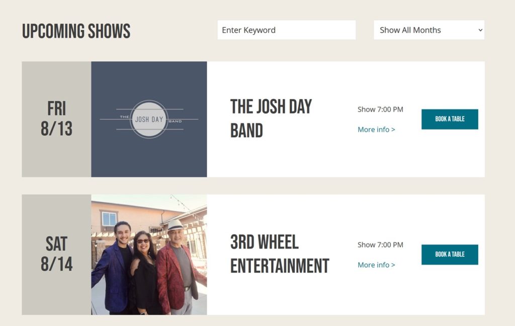
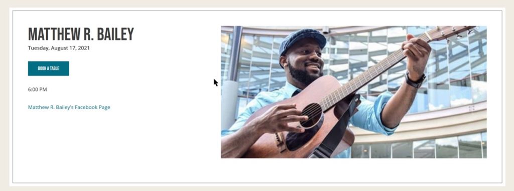
Landing 13 would host multiple events each week. The client wanted to make it easy for people in their area to find out about concerts and performances. We created a custom event listing page with drill-downs to individual details. Building on the above requirement, we made events easy for the Landing 13 staff to manage and update.

Get the Menu Right
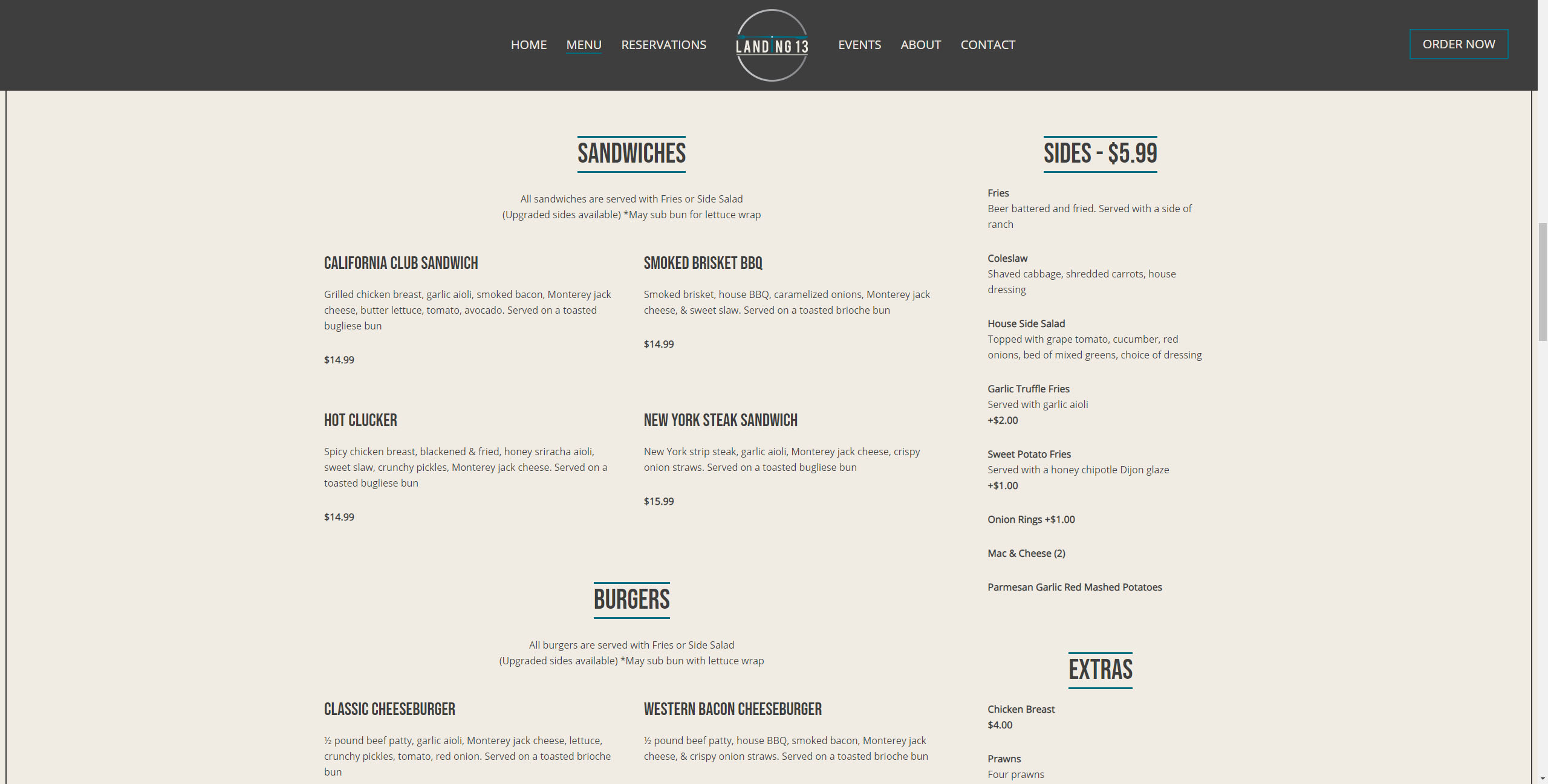
Many restaurant websites have a poor user experience for their menus. Our designer gave the Landing 13 menu extra attention to ensure it looked great on desktop and mobile devices. The Landing 13 team liked the design so much that they asked us to create a print-ready file for their physical menus.
What You See is What You Get
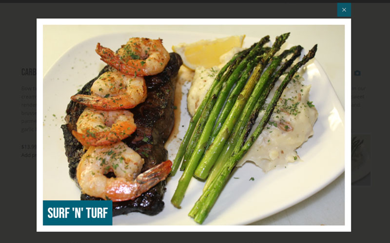
We’ve taken the menu a step further with a custom feature enabling mobile responsive previews and a larger lightbox view of food images.

Exceeded Our Expectations
Digital Agility Media has been great to work with. Their professionalism and adaptability in handling diverse projects (marketing campaigns, website creation, and restaurant launches) have been impressive. They provide fair pricing, timely delivery, and results that exceeded our expectations – a perfect partner for growth. Highly recommended for your web and marketing needs
Jeremiah Nicholas
Operations Manager

Like What You See?
Explore the rest of our portfolio and envision the possibilities for your brand. Boost your online presence with our bespoke digital marketing services. Or if you’re ready: schedule a consultation to turn your vision into reality.
